

Monday morning starts with a familiar puzzle. An operations manager opens spreadsheets from three clinics, checks a hospital admission log, scans the patient portal, and asks why waits rose last week. Each system contains part of the answer, but none shows the whole patient journey.
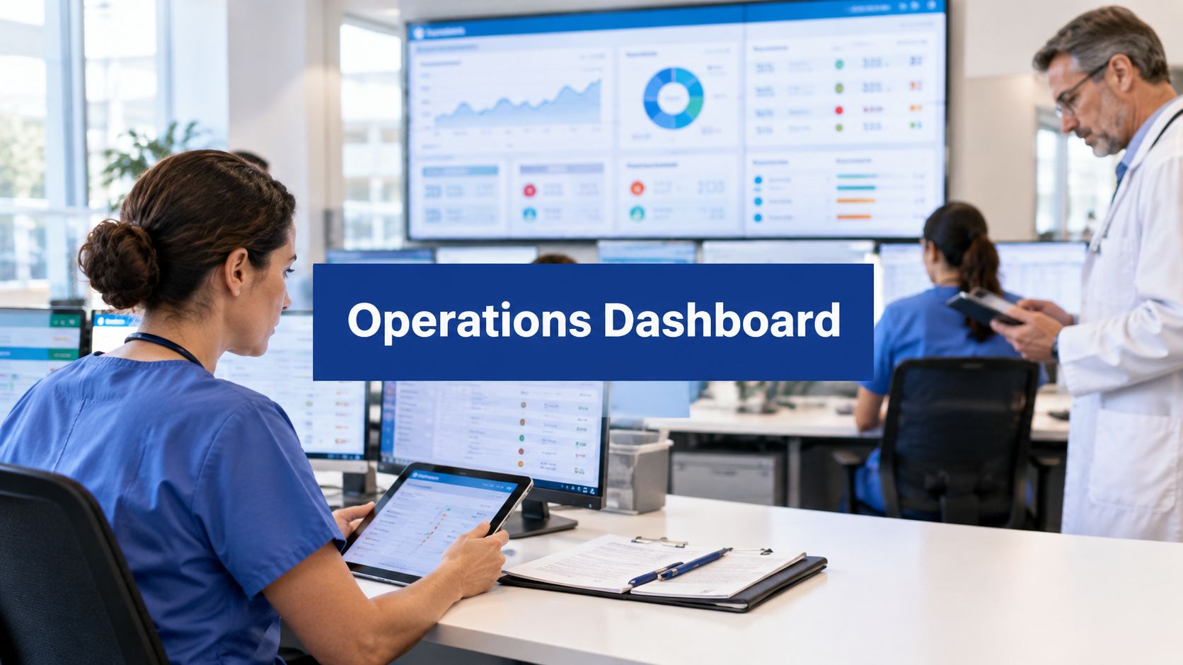
A healthcare operations dashboard brings those fragments into one operational view across clinics, providers, and patients. It connects access, acuity, staffing, patient flow, finance, and data reliability so leaders can act on a constraint rather than guess at its cause.
The sections below cover the core measures, integration architecture, data model, user experience, privacy safeguards, and implementation roadmap. By the end, you'll know what a trustworthy dashboard should show, what it must disclose, and how to start without waiting for every system to be perfect.
Why Healthcare Needs One Operational View
A clinic logs appointment delays, an emergency department logs arrivals, and a provider sees a full schedule, yet no one sees the whole pathway. The patient experiences one journey, while each team records only the part within its system. That gap makes a delay harder to understand and slower to address.
A fragmented view turns ordinary operational questions into detective work. Is access worsening because demand has changed, triage is slower, providers are unavailable, or admitted patients are waiting for beds? A spreadsheet can display a result, but rarely shows how that result connects to the next decision.
One operational view works like a control room. It brings clinic arrivals, referral status, provider schedule variance, emergency-department throughput, pending discharges, bed status, and appointment availability into a shared picture. Teams can keep their own workflows while leaders follow the patient pathway across sites.
The view also needs context. Data completeness shows whether a quiet chart reflects low activity or a missing feed. Acuity adjustment prevents a higher-risk caseload from being judged by the same expectations as routine demand. Patient flow connects front-door pressure with downstream capacity, rather than treating each queue as a separate problem. For organisations reviewing privacy and governance.
The cost of looking at one department
Emergency care often reveals pressure originating elsewhere. In 2024–2025, Canada recorded 16.1 million emergency-department visits, with reporting covering approximately 89% of Canadian emergency visits.
Those figures do not mean every organisation needs a national-style dashboard. They show why leaders should connect emergency access with staffing, referrals, beds, discharges, and patient experience. The result is clearer diagnosis: a wait can be linked to a staffing constraint, referral blockage, bed shortage, or incomplete data.
What a Healthcare Operations Dashboard Really Is
A simple healthcare data dashboard displays information. A static report summarises what happened. A healthcare operations dashboard goes further: it gives leaders one operational view for deciding what to do next across departments, clinics, providers, and sites.
A single flight's delay can begin with weather, a gate, or a crew. Healthcare operations follow the same pattern. A patient's long stay may start with arrival pressure and later become a bed-transfer problem. The dashboard must therefore connect events across the pathway, rather than present isolated departmental metrics.
Core definition: A healthcare operations dashboard is a decision-oriented view that connects operational events, capacity, resources, and outcomes across the care organisation.
Start with three KPI families
Group measures by the decision they support, not by the system that produced them.
Front-door measures: Track arrival mode, arrival volume, triage timing, time to physician assessment, acuity, and left-without-being-seen rates. These show whether patients can enter and access care.
Flow measures: Follow admissions, inpatient-bed waits, bed transfers, total length of stay, pending discharges, and transfer blockers. These show what happens after initial assessment and where the pathway slows.
Resource and finance measures: Place labour spend, staffing coverage, hospital expenditure, inpatient-bed utilisation, and cost per episode alongside activity measures. Leaders can then interpret resource use in context instead of reviewing finance separately.
In 2024–2025, ambulances accounted for 17% of emergency-department arrivals in Canada. Among completed visits, 88% ended in discharge and 12% resulted in hospital admission. At the same time, 7.7% of patients left before seeing a physician, median time to physician assessment was just under two hours, and one in ten patients waited more than five hours. For admitted patients, the inpatient-bed wait represented nearly two-thirds of total emergency-department time.
Read together, these measures support a more accurate diagnosis. A rising left-without-being-seen rate alongside longer assessment delays may indicate front-door pressure. Stable assessment times with growing bed-transfer delays suggest a downstream capacity constraint. Acuity matters too: a site treating higher-risk patients should not be judged against the same expectations as routine demand. The dashboard supports the conversation, while leaders decide the intervention.
Make the dashboard answer a question
Every visual should support an operational question:
Where is the queue forming?
Which patients, providers, or sites are affected?
Is the delay inside the clinic or elsewhere in the pathway?
Which constraint can the team influence today?
Is the data complete enough to support action?
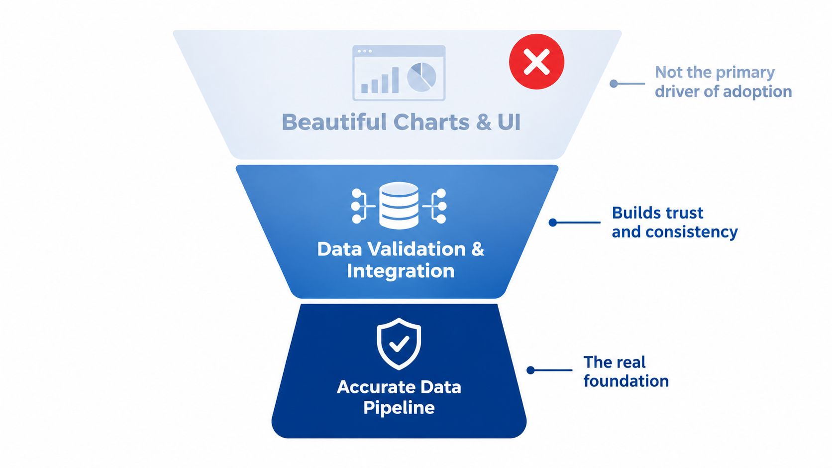
HealthcareOps analytics earns its place when it turns disconnected events into a sequence teams can investigate, discuss, and improve. Chart aesthetics may encourage attention, but complete data, fair acuity adjustment, and a system-wide view are what make the dashboard useful.
The Integration Reality Behind the Numbers
Beautiful charts don't create trust. Reliable data does.
A dashboard may display a precise occupancy figure while missing a discharge recorded in another system. It may show referral volume without a referral that remained in a separate clinic workflow. It may report appointment status without capturing a cancellation handled by phone. The interface looks authoritative because the numbers are formatted neatly, but the operational picture is incomplete.
Canadian digital-health access illustrates the problem. In 2025, only 13% of Canadian adults reported online access to all core components of their health records. Only 52% of healthcare providers reported sharing patient information electronically with providers outside their practice, while 17% didn't routinely access electronic information from other care settings because of barriers such as system integration, according to CIHI's assessment of Canada's health-information systems.
Build around events, not screens
A realistic integration plan considers the events that change an operational decision:
A referral is created, accepted, redirected, or closed.
A laboratory result becomes available.
A discharge summary is completed and shared.
Medication information changes.
An appointment is booked, moved, cancelled, or missed.
A patient arrives, is triaged, assessed, admitted, transferred, or discharged.
Those events may live in EHRs, referral platforms, laboratory systems, pharmacy records, scheduling tools, and patient portals. The dashboard needs a dependable integration layer that identifies the source, aligns definitions, and records when information was last refreshed.
For teams planning this work, a practical explanation of healthcare interoperability with HL7 FHIR APIs can help translate interoperability from an abstract ambition into a system-design conversation.
A dashboard should show not only the answer, but also how fresh, complete, and trustworthy that answer is.
Add transparency indicators
A trustworthy healthcare data dashboard makes uncertainty visible without making the interface unusable. Add:
Source labels: Identify the EHR, scheduling platform, referral system, or other originating source.
Refresh timestamps: Show when the data was last updated, not just when the screen was opened.
Missing-data flags: Distinguish zero activity from an unavailable feed.
Coverage notes: Explain which clinics, professions, or facilities are included.
Ownership markers: Give a named team responsibility for investigating quality issues.
The Pan-Canadian Interoperability Roadmap points towards common data standards and secure information exchange across systems. For clinics and hospitals, that direction supports a more disciplined approach: design integrations for shared definitions and exchange from the start, rather than building another isolated reporting layer.
Architecture and the Data Model That Powers It
A reliable dashboard usually has four layers. Each layer answers a different question, and skipping one creates problems later.
The four working layers
Source systems hold the original records. These may include EHRs, scheduling systems, referral tools, laboratory platforms, workforce systems, finance applications, and patient-facing services.
The integration layer receives and reconciles those records. It handles interfaces, transformations, identity matching, validation, error queues, and refresh schedules. Here the organisation decides how different systems describe the same event.
The dimensional data model organises events for analysis. A practical fact model can include encounter ID, facility peer group, CTAS category, arrival timestamp, triage timestamp, physician-assessment timestamp, admission decision, bed-transfer timestamp, and disposition.
The presentation layer turns trusted measures into role-based views. Executives may need a cross-site summary. A ward manager may need bed movement and discharge blockers. A clinic lead may need referrals, no-shows, provider schedule variance, and next-available appointment slots.
For a broader explanation of how centralised storage can support modern health technology, see this discussion of how a healthcare data lake powers modern healthtech.
Calculate distributions, not just averages
At each process stage, calculate volume, median, 90th percentile, and breach rate. A median describes the middle of the experience. The 90th percentile shows the long tail, where operational instability and patient harm may be concentrated. A breach rate connects the measure to a service threshold defined by the organisation.
Finance belongs in the same model. CIHI projected $372 billion in Canadian health spending in 2024, equal to $9,054 per Canadian and 12.4% of GDP. Hospitals represented 26% of total health expenditures, while hospital spending was projected to grow 6.1%.
That context supports linking expenditure with emergency visits, admissions, inpatient-bed utilisation, length of stay, labour costs, and cost per episode or patient group. Rising spend may reflect demand, greater complexity, capacity constraints, or inefficient flow. The model should help leaders tell those possibilities apart.
| KPI Family | Example Measures | Decision It Informs |
|---|---|---|
| Access | Arrival volume, time to physician assessment, left-without-being-seen rate | Should the organisation change intake, triage, or staffing? |
| Patient flow | Admissions, bed-transfer delay, length of stay, pending discharges | Is downstream capacity restricting access? |
| Workforce | Staffing coverage, provider schedule variance, workload by site | Where should leaders adjust deployment or schedules? |
| Finance | Labour spend, expenditure by service, cost per episode | Is resource growth linked to demand, complexity, or inefficiency? |
| Data reliability | Refresh time, missing events, source coverage, interface errors | Can leaders act on the displayed result with confidence? |
Standard definitions make comparisons more useful across provinces, regions, peer facilities, and rural or urban settings. Without standardisation, a benchmark can look scientific while comparing different processes.
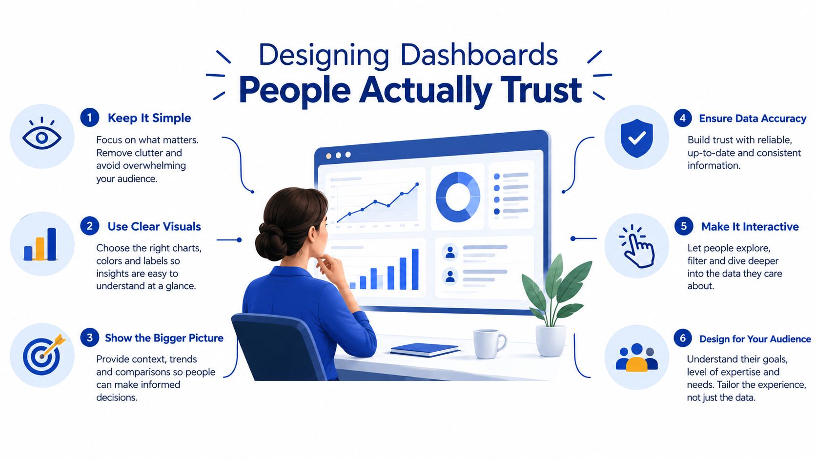
Designing Dashboards People Actually Trust
A good screen helps a person see the next decision quickly. It doesn't force an executive to inspect a queue-level chart, or a front-desk team member to interpret a financial trend before finding today's appointment status.
Use progressive disclosure. Put the operational summary first, then let users drill into site, service, provider, acuity, time period, and individual events where their role permits. A mobile-friendly layout matters for clinicians and managers who review information away from a desktop.
Give each role a useful first screen
A dashboard becomes easier to adopt when it respects the user's work:
Executives need cross-site trends, financial context, access risk, and exceptions.
Operations managers need queues, capacity, staffing variance, discharge blockers, and referral leakage.
Ward leaders need bed status, pending transfers, isolation capacity, and expected discharges.
Front-desk teams need appointment status, no-shows, next-available slots, and patient communication tasks.
Clinicians need concise patient-flow context without unnecessary administrative noise.
Visual hierarchy should do the work. Use short labels, restrained colour, clear status definitions, and a limited number of prominent alerts. A chart that requires a meeting to explain it isn't serving the person who needs it during a busy shift.
Adjust for acuity and geography
Unadjusted averages can misclassify performance because patient mix differs. CIHI's 2024–2025 data show 90th-percentile waits for physician assessment of 4.3 hours for resuscitation or emergent patients, CTAS 1–2, 5.8 hours for urgent patients, CTAS 3, and 5.9 hours for less-urgent or non-urgent patients, CTAS 4–5. One in ten Canadian emergency-department patients waited more than 14 hours, a 28% increase from 2018–2019.
Show acuity-specific measures beside overall results. Include medians, 90th percentiles, and control-chart trends so leaders can see tail risk rather than reacting to one isolated value. Suppress or aggregate small cells to protect privacy.
Urban and rural facilities also need appropriate peer groups. A small remote hospital shouldn't be judged against a large urban centre without accounting for demand, workforce, specialty access, and available beds. Honest comparison explains variation instead of hiding it behind one ranking.
For practical guidance on visual hierarchy and accessible presentation, see this resource on healthcare data visualisation.
Security, Compliance, and Your Implementation Roadmap
Security belongs in the design conversation from the first data-flow sketch. A dashboard brings sensitive information into a concentrated view, so access should follow a person's role, responsibilities, and legitimate need.
Use role-based access, audit trails, encryption in transit and at rest, and small-cell suppression. Give each data-quality issue an owner, because privacy controls won't fix a missing discharge or an outdated appointment feed.
Protect the information and the decision
A privacy-by-design dashboard should answer four practical questions:
Who can see this?
Restrict patient-level detail to authorised roles and provide aggregated views for broader audiences.
What changed?
Keep audit trails for access, exports, configuration changes, and data corrections.
How is it protected?
Encrypt data during transfer and while stored.
Who owns accuracy?
Assign responsibility for source feeds, definitions, reconciliation, and issue resolution.
Interoperability also affects continuity of care. In 2024, 97% of Canadian health-care providers reported access to some form of patient clinical information and 92% reported access to a digital health system, but only 52% used a digital system to share information with providers outside their main practice. External sharing was reported by 64% of family physicians, 62% of specialists, and 61% of nurse practitioners, compared with 48% of nurses and 49% of pharmacists, according to Statistics Canada's survey of digital technologies used by health-care providers.
Take a phased route
First, audit the current environment: List systems, owners, interfaces, identifiers, refresh patterns, manual workarounds, and known gaps. Prioritise referrals, discharge summaries, laboratory results, medication information, and appointment status because those events directly affect continuity.
Next, define KPIs with clinical and operational stakeholders: Agree on terms such as arrival, admission, discharge, delay, no-show, and completed visit before building charts. Record the numerator, denominator, time window, exclusions, peer group, and owner for every measure.
Then, build the integration layer and fact model: Start with validated events, source labels, timestamps, error handling, and a clear approach to identity matching. A smaller trustworthy model is more useful than a broad model filled with unverified assumptions.
Pilot with one clinic or department: Test whether people can find the answer they need during normal work. Review false alerts, missing records, permissions, and definitions with the people who use the dashboard.
Scale across sites with training and governance: Keep a change log, review metric definitions, monitor data freshness, and create a route for users to challenge a result. Adoption grows when staff can see how the dashboard supports their work rather than replacing their judgement.
Real-World Use Cases From Urban Hospitals to Rural Clinics
An urban hospital network may start by blaming emergency-department waits on slow triage. A single operational view compares arrivals, triage timing, physician assessment, admissions, bed availability, and discharge status across sites. It may show that triage is running normally while admitted patients wait for acute-care beds.
That changes the response. Rather than adding pressure at the entrance, the network can focus on discharge planning, bed turnover, and transfer coordination. CIHI reported that, in 2024–2025, the acute-care inpatient-bed wait accounted for an average of 59% of an admitted patient's total emergency-department stay. At the 90th percentile, total emergency-department time in large urban hospitals increased from 13.9 hours in 2018–2019 to 17.4 hours in 2024–2025.
A rural clinic group can use the same design to examine referral access. Leaders compare referrals sent, referrals accepted, appointment outcomes, no-shows, provider availability, and next-available slots across sites. Lower appointment volume may indicate referral leakage or limited specialist access, rather than weak reception performance.
Geography still matters. At the 90th percentile, total emergency-department time in small rural or remote hospitals rose from 5.4 hours in 2018–2019 to 6.9 hours in 2024–2025, as the same CIHI analysis reports. In both settings, the dashboard's value is pointing the team towards the upstream constraint, bed turnover in the urban network and referral leakage in the rural group, rather than the symptom that first drew attention.
Frequently Asked Questions
How long does a realistic implementation take for a mid-sized clinic group?
It depends on the number of sites, source systems, data quality, and governance decisions. A realistic plan starts with a focused pilot rather than promising a complete enterprise view immediately.
Begin with a small set of trusted workflows, such as appointment access, referrals, or provider schedule variance. Expand after users can validate the definitions and act on the results.
Can a healthcare operations dashboard work alongside an existing EHR?
Yes. The dashboard should usually sit above existing systems, not replace them. The EHR remains the system of record, while the dashboard combines operational events from the EHR and connected platforms for analysis and coordination.
Make the relationship explicit. Show source labels, refresh times, and links or pathways back to the relevant workflow so staff know where to verify or update a record.
What should a small clinic track first?
Start with measures that connect directly to daily decisions: appointment access, no-shows or cancellations, and provider schedule variance. These can reveal whether patients are getting timely access and whether planned capacity matches actual delivery.
Add more measures only when the underlying data is dependable. A narrow dashboard with clear ownership is safer and more useful than an ambitious view built on incomplete records.
Cleffex Digital Ltd builds custom healthcare software, including operational KPI dashboards and integrations that connect access, throughput, staffing, patient flow, and data reliability. Visit Cleffex Digital Ltd to discuss a practical single operational view for your clinics, providers, and patients.