


Canadian healthcare organisations do not have a data shortage. They have a decision-speed problem.
Hospitals, regional health authorities, and insurers now pull information from EHRs, claims platforms, scheduling systems, provincial repositories, contact centres, and spreadsheets maintained outside formal governance. The operational risk is not volume alone. It is the absence of a shared view that leaders trust enough to use for staffing, utilisation management, care coordination, fraud review, and financial planning.
That is why healthcare data visualisation now belongs in enterprise strategy, not just in analytics teams. A useful dashboard should shorten the time between signal and action. A poor one creates the opposite result. It masks data quality issues, spreads conflicting definitions across departments, and pushes executives to make decisions from static reports that are already out of date.
In Canadian organisations, the implementation challenge is usually more practical than conceptual. Teams need to choose whether to standardise on Power BI, Tableau, or Qlik. They need to decide how visual layers will connect to Epic, Cerner, Meditech, claims systems, and provincial data feeds. They need role-based access that aligns with PHIPA, PIPEDA, and internal privacy controls. They also need a data model strong enough to support both hospital operations and payer reporting without creating a separate dashboard for every department.
That work starts upstream with governance and architecture. A weak data foundation produces attractive dashboards that fail under executive scrutiny. A stronger approach begins with clear ownership of metrics, refresh logic, and exception workflows, then builds visual products on top of a managed data layer. Organisations that have not addressed that foundation should first strengthen their healthcare data management strategy.
The payoff is practical. Better visualisation helps leaders see capacity pressure earlier, compare performance across sites, spot revenue leakage, and identify where intervention will change outcomes. This guide focuses on how Canadian healthcare organisations can implement that capability, choose vendors with realistic criteria, and tie visualisation investment to compliance, adoption, and measurable ROI.
From Data to Decisions: Why Visualisation Matters Now
A delayed decision in healthcare carries a direct cost. One missed capacity signal can cascade into longer emergency department waits, cancelled procedures, overtime pressure, avoidable transfers, and disputed claims within the same reporting cycle.
That is why visualisation now sits closer to operational infrastructure than executive reporting. Canadian providers and insurers already collect more data than their teams can review manually. The issue is not access. The issue is whether leaders can identify a meaningful change early enough to act on it.
Pandemic reporting made that visible across Canada. PHAC dashboards gave health system leaders a shared operational view of cases, capacity, and regional pressure. The larger lesson still applies: clear visual reporting improves coordination across sites, shortens escalation time, and reduces debate over which numbers are current.
Raw exports do none of that well. A spreadsheet can confirm what happened last week. A well-built dashboard helps an operations lead, medical director, or claims executive decide what to do in the next hour.
What Changes When Visualisation Is Treated As Infrastructure
Useful visualisation answers a defined operational question and ties it to an owner. In practice, that means a dashboard should support decisions such as:
Capacity pressure: Which hospitals, programs, or departments need staffing changes, diversion planning, or discharge escalation today?
Clinical risk: Which patient groups show deterioration, readmission risk, or missed follow-up patterns that warrant intervention?
Financial leakage: Which claims, coding patterns, prior authorisations, or utilisation shifts need review before loss accumulates?
Executive oversight: Which indicators require board-level attention, and which belong with local managers or service-line leaders?
For teams building a broader analytics capability, healthcare data analytics solutions often provide the governed data layer, metric logic, and refresh controls that make visual reporting dependable instead of cosmetic.
Practical rule: If a dashboard does not trigger a decision, an intervention, or a workflow change, it is reporting overhead.
What Works and What Doesn’t
What works is a narrow use case, trusted metric definitions, and role-based design. A chief nursing officer needs a different view from a bed manager. A provincial program lead needs different filters from a fraud investigation team. In Canadian organisations, that separation also helps privacy teams limit exposure to personal health information under PHIPA and internal access policies.
What fails is familiar. One enterprise dashboard for every audience. Twenty KPIs on the landing page. Conflicting definitions of length of stay, avoidable denial, or alternate level of care. No owner for data quality, and no workflow for exceptions.
I have seen hospitals spend months polishing interfaces while executives still ask finance and clinical operations to validate numbers in parallel. That is not a visualisation problem. It is an implementation problem. The organisations that get value treat dashboards as products with governance, service levels, adoption targets, and a clear link to operational and financial outcomes.
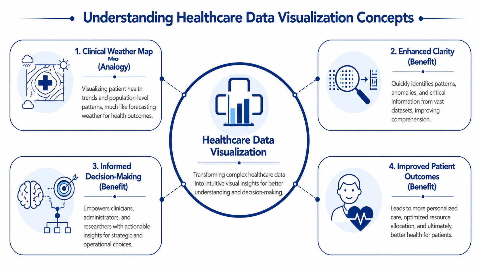
Understanding Healthcare Data Visualisation Concepts
Think of healthcare data visualisation as a clinical weather map. A weather map doesn’t show every molecule in the atmosphere. It turns huge volumes of measurements into patterns people can act on. Healthcare data visualisation does the same thing for patient care, operations, and insurance performance.
Instead of asking a leader to scan thousands of rows from a claims export or an EHR report, visualisation turns those records into trend lines, heat maps, risk flags, and drill-down views. The point isn’t decoration. The point is pattern recognition.
Where the Data Comes From
Most healthcare dashboards draw from a mix of structured and semi-structured sources. In a Canadian setting, the usual sources include:
Clinical systems: EHRs, lab systems, radiology systems, and patient administration platforms
Operational tools: Bed management, scheduling, staffing, and referral systems
Insurance and revenue data: Claims, adjudication platforms, billing records, and fraud review tools
Connected streams: Remote monitoring devices, ICU telemetry, and wearables where appropriate
Public and regional datasets: Provincial registries, public health feeds, and internal quality reporting
That variety is why visualisation projects fail when teams jump straight to dashboard design. If source systems disagree on patient identity, encounter timing, or claim status, the chart may look clean while the underlying truth remains fragmented.
How the Pipeline Actually Works
The core flow is straightforward, even when the architecture is not.
Extract data from source systems.
Transform it into common definitions, formats, and time windows.
Load it into a warehouse, mart, or reporting layer optimised for analysis.
Present it through dashboards or interactive visuals tied to user roles.
Governance is essential. Metrics such as length of stay, wait time, readmission, claims cycle status, or provider utilisation need one agreed definition. If finance and operations each calculate the same metric differently, a dashboard will amplify confusion instead of resolving it.
A good grounding in healthcare data management is often what separates durable visual systems from short-lived reporting projects.
Which Visual Forms Suit Which Jobs
Not every chart belongs in a healthcare environment. The choice should match the decision.
| Visual type | Best use | Common mistake |
|---|---|---|
| Time-series charts | Tracking wait times, admissions, occupancy, claims flow, and intervention impact | Cramming in too many lines that no one can read |
| Heat maps | Showing geographic variation, service pressure, and cohort risk | Using colour scales so aggressive that minor variation looks critical |
| Scatter plots | Spotting outliers in utilisation, outcomes, or patient monitoring | Assuming correlation means causation |
| KPI cards | Giving executives a quick operational snapshot | Displaying isolated numbers without trend or context |
| Drill-down dashboards | Letting managers move from summary to unit, provider, or cohort detail | Forcing every user through the same drill path |
A useful healthcare dashboard doesn’t answer every question. It helps the right person ask the next one faster.
The Clinical and Business Value of Visual Insights
A dashboard earns its place when it changes a decision that affects cost, capacity, or patient outcomes. For Canadian hospitals and insurers, that usually means three things. Spotting variation earlier, shortening the time from issue to intervention, and giving executives one operating view they can trust across clinical, financial, and compliance teams.

The strongest programs treat visualisation as part of operating management, not a reporting add-on. In practice, that means linking a visual layer to workflows, ownership, and escalation rules. A wait-time dashboard without service-line accountability becomes wall art. A claims dashboard without exception routing becomes another screen people glance at and ignore.
Clinical Value
Clinical teams use visual systems to answer a small set of recurring questions fast. Where is care variation widening? Which units are falling behind target? Which patient cohorts need intervention before the issue shows up as a readmission, ED revisit, or avoidable transfer?
In Canadian organisations, that value often shows up first in command centres, quality committees, and service-line reviews. A good dashboard lets a chief nursing officer compare occupancy pressure by site, then drill into discharge delays, staffing mix, and bed turnover. A medical director can review treatment variation by physician group without waiting for an analyst to rebuild the report. Public health and population health teams can map screening gaps or chronic disease burden by region and tie outreach dollars to the highest-need areas.
The chart is only one part of the result. The business case comes from what teams do next.
Clinical leaders usually get the best return when dashboards support decisions such as:
Escalation and staffing: identifying units that need immediate staffing changes, flow support, or clinical review
Variation reduction: finding outlier patterns in prescribing, testing, or length of stay before they become a budget and quality problem
Access management: seeing referral backlogs, surgical bottlenecks, or imaging delays early enough to reallocate capacity
Population health planning: targeting prevention, follow-up, and community programs by geography, risk, and service use
Design matters here. Clinicians work under time pressure, and overloaded interfaces slow interpretation. The teams that get adoption usually apply basic UX design fundamentals and then adapt them for clinical settings, with clear hierarchy, restrained colour use, and drill-down paths that match real workflows.
Business Value
For hospital executives, the first gains are usually operational. Better visibility into throughput, discharge barriers, overtime, agency labour, and procedure backlog helps leaders act within the current funding envelope instead of explaining performance after month-end. For insurers and benefits administrators, the same principle applies to claims intake, denial patterns, provider behaviour, prior authorisation queues, and fraud review.
I usually advise buyers to test value against a few measurable management actions. Can the dashboard cut analyst preparation time for weekly operating reviews? Can it reduce manual queue triage in claims operations? Can it give finance and operations one view of utilisation and unit cost before budget variance turns into a board issue?
That is where ROI becomes credible. Faster decisions reduce avoidable handoffs. Better prioritisation improves staff time use. Shared visibility cuts down on the common Canadian enterprise problem of each region, facility, or business unit maintaining its own version of performance truth.
For regulated environments, the financial case also depends on how the product handles auditability, access control, and privacy by design. Teams evaluating platforms should look closely at the architecture and controls used in healthcare compliance software development, especially when dashboards combine PHI, claims data, and third-party datasets across provinces.
Where Buyers Overestimate Value
Visualisation does not repair weak governance, poor source data, or unclear operating policy. If utilisation definitions differ by site, a clean dashboard will spread disagreement faster. If claims adjudication rules are inconsistent, exception views only make the inconsistency more visible.
Vendor selection is where this often goes wrong. Buyers focus on visual polish and miss harder questions about Canadian hosting options, role-based access, integration with EMRs and claims platforms, metadata management, and how quickly business users can change logic without creating governance risk.
The practical test is simple. Choose tools that support enterprise decisions, fit provincial privacy obligations, and work with the data team you have. That standard produces more value than a flashy demo.
Real-World Healthcare Visualisation in Action
The highest-value visual systems are easy to recognise. They sit close to real operational pain, and the people using them can tell you exactly what changed once the dashboard went live.

A strong Canadian example comes from ICU monitoring in British Columbia. Real-time patient monitoring visualisations using IoT wearables turned vital signs into interactive charts, reducing the time to detect critical events from 5.2 minutes to 1.8 minutes. That faster visibility led to 28% faster ventilator adjustments and a 14% reduction in mortality risk in Fraser Health Authority studies, as described in this patient outcomes and visualisation reference.
ICU Monitoring Where Seconds Matter
This use case works because the visual design matches the urgency of the environment. Staff need trend visibility, threshold awareness, and clear exception cues. They do not need decorative dashboards or dense menus.
The best patient monitoring views usually share a few traits:
Trend-first design: Clinicians see direction, not just the latest reading
Clear thresholds: Risk states are visually distinct without creating alarm fatigue
Low interaction burden: Staff can interpret the screen quickly during active care
Action alignment: The dashboard supports an intervention pathway, not passive observation
In high-acuity settings, a chart is part of the workflow. That changes how strict the usability standard has to be.
Population Health and Outreach Planning
Population health teams use visualisation differently. Their job isn’t bedside intervention. It’s deciding where outreach, education, screening, or chronic care support should concentrate.
A well-built regional dashboard can show where disease burden, access issues, and service utilisation diverge across communities. The best versions let users move from province or region down to facility, service line, or patient cohort without losing context. This is also where qualitative input matters. Many organisations supplement dashboard findings with provider feedback, and tools that help create surveys for healthcare providers can make that loop more structured when teams need to validate what frontline staff are seeing.
Hospital Command Centres and Insurance Review Desks
Operational command centres rely on visualisation for flow management. They need to know where admissions back up, where discharge delays are accumulating, and where staffing pressure is likely to hit next. The dashboard’s job is to reduce coordination lag across departments that usually operate on separate systems.
Insurance teams use similar logic with different signals. Instead of bed turnover and wait times, they’re looking at claim queues, provider patterns, adjudication exceptions, and suspicious billing clusters. Heat maps and outlier views are especially useful here because they let analysts narrow their investigation effort quickly.
When a dashboard works, teams stop asking, “What happened?” and start asking, “Who owns the next action?”
What These Examples Have in Common
These use cases look different, but the winning pattern is the same. Each one starts with a specific operational decision, maps the data needed to support it, and then designs the visual layer around that decision path. That’s why practical healthcare data visualisation feels focused, not flashy.
Designing Compliant and Effective Visualisations
Most healthcare dashboards fail for one of two reasons. They’re hard to use, or they’re hard to trust. In Canadian healthcare, you need to solve both problems at once.
A visually clear dashboard that leaks access to the wrong role is unacceptable. A technically compliant dashboard that no one can interpret under pressure isn’t much better. Effective healthcare data visualisation balances usability, governance, and data integrity from the first design review.
Start With Chart Discipline
Teams often pick visuals based on what a BI tool makes easy, not on what the user needs to decide. That habit creates clutter fast. Pie charts, overloaded scorecards, and rainbow colour schemes still show up in healthcare settings where precision matters.
A few design rules hold up well in practice:
Use line charts for change over time: Wait times, claims backlogs, occupancy, and deterioration trends need temporal context
Use heat maps selectively: They work for geography and concentration, but only if the colour scale is restrained
Show benchmarks beside current values: A number without a target or trend forces users to guess
Reduce visual noise: If labels, legends, and filters compete with the signal, the dashboard slows decisions
Design for drill-down: Executives need a summary. Managers need causation. Analysts need underlying records
Teams refining interface behaviour often benefit from revisiting broader UX design fundamentals, especially around hierarchy, interaction cost, and error prevention.
The cleanest dashboard isn’t the one with the fewest widgets. It’s the one that makes the next decision obvious.
Build Privacy Into the Experience
In Canada, privacy compliance shapes the design itself. PHIPA and PIPEDA considerations shouldn’t be bolted on after the interface is approved. They affect data exposure, user views, auditability, and what can be exported.
Practical safeguards usually include:
Role-based access: Clinicians, executives, claims investigators, and vendor users should see different levels of detail
Minimum necessary data: If a task can be completed with de-identified or aggregated information, use that
Context-aware drill-down: The ability to click into patient-level or claim-level detail should be tightly controlled
Auditability: You need to know who accessed what and when
Secure sharing rules: Screenshots, exports, and scheduled email reports create risk if left unchecked
Organisations commissioning these systems should understand the software implications as clearly as the policy ones. This overview of healthcare compliance software development is a useful reference point when technical and legal teams need a common frame.
Accuracy Is a Design Problem Too
Executives usually think of accuracy as a data engineering issue. It is, but it’s also a presentation issue. Dashboards mislead when they hide refresh timing, mix definitions on one screen, or flatten uncertainty into a single number.
That’s why trustworthy dashboards display metadata clearly. Users should know whether data is near real-time, daily, weekly, or manually refreshed. They should also know when a value is preliminary, lagged, or derived from multiple systems.
Your Healthcare Data Visualisation Implementation Roadmap
A sound implementation starts before any vendor opens Tableau, Power BI, or Apache Superset. If your team can’t name the decisions the dashboard must support, you’re not ready for a build.
In Canadian health systems, modern dashboards often rely on real-time ETL pipelines, role-based access controls, dynamic refreshes every 15 to 60 seconds, and performance tuned to handle 10M+ rows at under 2 seconds query latency. In the cited case-study summary, this approach showed a 35% reduction in decision-making time for resource allocation in Canadian health system contexts, as outlined in this dashboard architecture reference.
Phase One: With Strategy and Governance
Start with governance, not software demos. The first decisions are organisational:
Choose a narrow first use case. Bed flow, ED wait times, claims anomaly review, or chronic disease cohort management are all sensible starts.
Define KPI ownership. Every metric needs a business owner, a technical owner, and an agreed-upon definition.
Set escalation rules. Decide what threshold triggers review, by whom, and within what workflow.
Establish privacy controls early. Access models affect architecture, not just permissions.
This phase is where many programmes save themselves from expensive rework. A dashboard built without metric governance usually turns into a dispute-resolution tool rather than a decision-support system.
Phase Two: With Architecture and Tool Selection
The right stack depends on your data environment, internal capability, and compliance posture.
Off-the-shelf BI tools such as Power BI, Tableau, and Apache Superset work well when the core need is interactive reporting on governed datasets. They’re faster to deploy, easier to maintain, and familiar to many internal teams. Custom application layers make more sense when you need specialised workflows, embedded analytics inside a product, unusual security constraints, or user experiences that standard BI tools handle poorly.
A practical architecture often includes:
Source connectors into EHR, claims, finance, and operational systems
ETL or ELT pipelines for normalisation and enrichment
A warehouse or data mart designed for analytics workloads
A semantic layer that standardises business definitions
A presentation layer in a BI platform or a custom front-end
Identity and access controls tied to enterprise authentication
Phase Three: With Integration and Validation
Integration work is usually where timelines slip. Data field names may match, while business meaning does not. Timestamps may represent order time in one system and completion time in another. Claim states may differ across payer, provider, and internal review tools.
Validation needs to happen on three levels:
Data validation: Are values complete, accurate, and timely?
Metric validation: Do published KPIs match agreed definitions?
Workflow validation: Does the dashboard help the user make the intended decision?
Implementation note: Pilot with one user group that has a clear pain point and authority to act. Adoption spreads faster when the first dashboard solves a visible problem.
Phase Four: With Rollout and Adoption
Training should be role-based, not generic. Executives need interpretation guidance. Managers need drill-down fluency. Analysts need exception handling and traceability.
The strongest rollouts also create a feedback loop. Users should be able to flag ambiguous labels, broken filters, suspicious data, and missing context. In practice, the dashboard is never finished. It moves through controlled refinement as teams learn which views drive action and which ones just consume screen space.
Choosing the Right Data Visualisation Partner
Most procurement mistakes happen before contracting. Teams focus on demo polish and pricing, then discover too late that the partner lacks healthcare workflow knowledge, underestimates integration complexity, or treats compliance as a documentation exercise.
For Canadian organisations, a suitable healthcare data visualisation partner needs more than dashboard talent. They need fluency in clinical and insurance operations, experience working with regulated data, and the discipline to design around decisions rather than graphics.
What To Test in Vendor Conversations
Ask practical questions. Which healthcare systems have they integrated with? How do they handle role-based views? What’s their method for metric definition and validation? How do they manage audit trails, export controls, and environment segregation? If they answer mostly in design language and not in operational language, that’s a warning sign.
You should also push on the implementation reality. Some vendors are excellent with mock-ups but weak on data engineering. Others are strong on pipelines and weak on adoption. You need both.
| Evaluation Criterion | What to Look For | Why It Matters |
|---|---|---|
| Healthcare domain expertise | Experience with hospital operations, claims workflows, care pathways, and executive reporting | Healthcare users won’t adopt dashboards that ignore real workflow pressure |
| Canadian compliance knowledge | Working knowledge of PHIPA, PIPEDA, access controls, audit requirements, and de-identification practices | Compliance affects architecture, user design, and support processes |
| Integration capability | Ability to work with EHRs, claims systems, finance platforms, identity providers, and data warehouses | Most projects fail at the joins between systems, not in the visual layer |
| Tool neutrality | Comfort with Power BI, Tableau, Apache Superset, and custom front ends when needed | The best partner fits the tool to the use case instead of forcing one stack |
| Data governance method | Clear process for KPI definitions, source mapping, validation, and change control | Trusted metrics are the backbone of executive adoption |
| Performance thinking | Attention to refresh strategy, query tuning, and scale under real workloads | A slow dashboard gets abandoned, even if the design is good |
| Security engineering | Role-based access, secure deployment patterns, logging, and controlled exports | Sensitive data needs protection beyond surface-level permissions |
| Adoption support | Training plans, usage feedback loops, and post-launch refinement | Value appears only when teams use the system consistently |
Off-the-Shelf Platform or Custom Partner
Off-the-shelf BI platforms are often the right answer when your organisation already has a strong data foundation and needs faster deployment. They’re usually cheaper to start, easier to staff, and sufficient for many executive, operational, and insurance reporting needs.
Custom development becomes more compelling when you need a differentiated user experience, specialised workflows, embedded analytics, or strict integration and permission models that standard dashboards handle awkwardly. The trade-off is straightforward. Custom gives a tighter fit and more control, but it asks for stronger governance and a partner who can operate at enterprise depth.
The best buying decision usually isn’t “build versus buy.” It’s “where should we standardise, and where do we need custom capability?”
If your organisation needs a healthcare data visualisation platform that’s compliant, scalable, and designed around operational decisions, Cleffex Digital Ltd can help evaluate the right architecture, integration approach, and delivery model for Canadian healthcare and insurance environments.


