


Ecommerce web designing is so much more than just making a pretty online store. It’s the art and science of creating a digital experience that’s a joy to use, guides visitors effortlessly, and, most importantly, turns them into loyal customers. It’s a careful blend of user experience (UX), user interface (UI), and compelling brand storytelling, all working together to build a storefront that actually drives sales.
Get the design foundation right, and you’ll build customer trust and keep them engaged. This directly impacts your bottom line.
Building Your Ecommerce Design Foundation
Before you even think about a colour palette or writing a single line of code, you need a solid plan. This is where your business goals get translated into a real design blueprint. Skipping this step is a recipe for disaster; it’s far better to ask the tough questions now than to pay for a costly redesign down the road.
Think of it this way: you’re not just building a website; you’re building a sales engine. A strong foundation ensures the site you create not only connects with your audience today but can also grow with you tomorrow.
Define Your Goals and Audience
First things first, what does success actually look like for your business? Are you trying to bump up the average order value? Slash your cart abandonment rate? Maybe you’re looking to break into a whole new market. Your goals will shape every single design choice you make.
For example, if the goal is to increase how much people spend, you’d design prominent up-sell and cross-sell sections on your product and cart pages. It’s a direct line from goal to design feature.
At the same time, you need to get inside the heads of your ideal customers. Basic demographics aren’t enough. You need to build out detailed user personas. What are their biggest frustrations? What truly motivates them to click “buy”? A persona for a time-crunched parent will demand a design that screams speed and convenience – think one-click checkout. On the other hand, a hobbyist might crave detailed product comparisons and be swayed by community reviews.
This simple diagram breaks down the three core pillars of a successful ecommerce project.
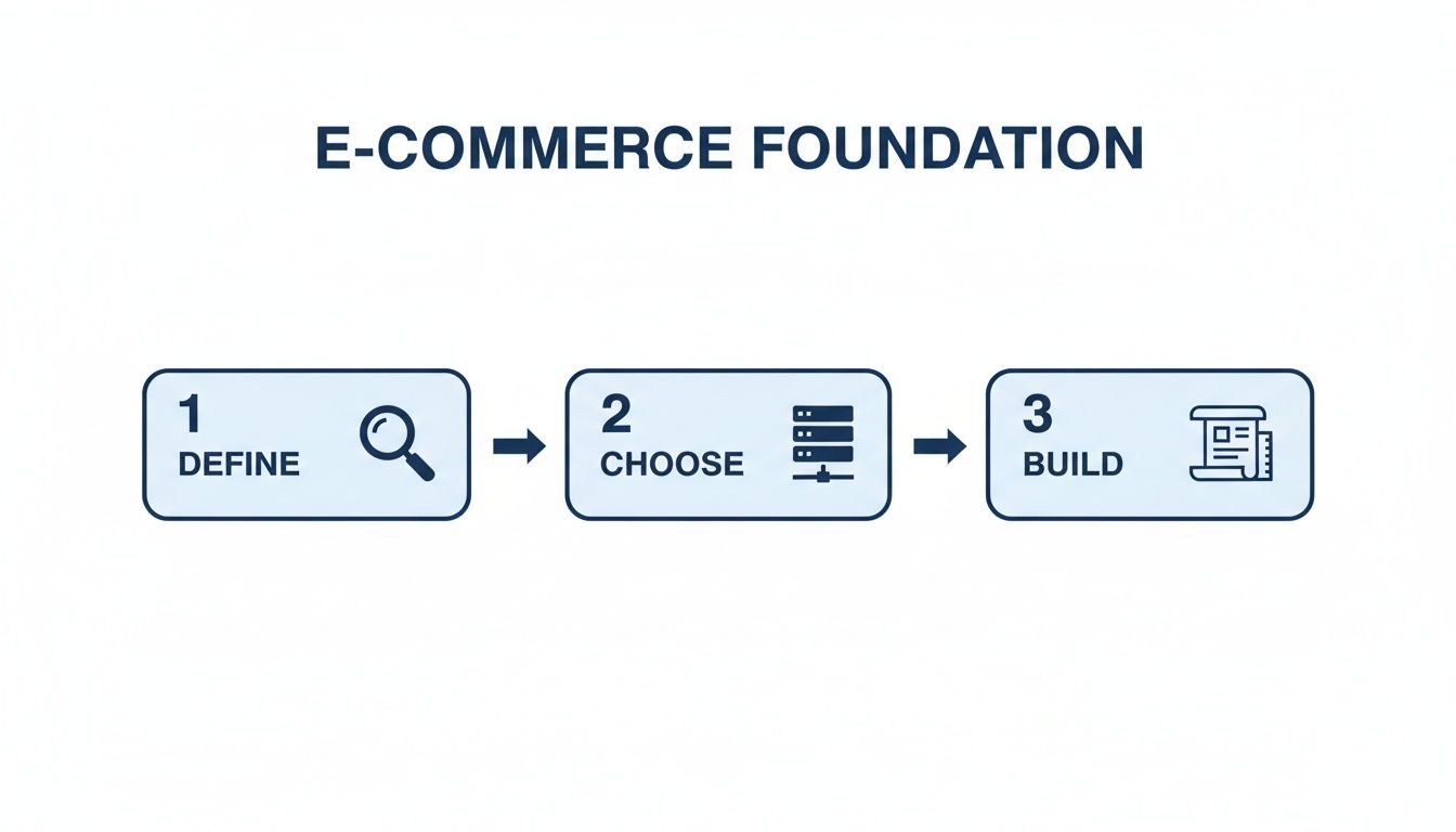
It really shows how defining your strategy, picking the right tech, and thoughtfully building your site are all connected and need to happen in that order.
Choose Your Ecommerce Platform
The technology powering your store is just as vital as the design itself. The platform you choose will affect everything from how much you can customise to how well your site can handle growth down the line.
You generally have three main paths to consider:
- SaaS Platforms (Shopify, BigCommerce): These are fantastic all-in-one solutions, perfect for most small and medium-sized businesses. They handle hosting, security, and give you a user-friendly dashboard. Shopify is a dominant force, powering over 160,000 stores in a market like California alone, which generate $57.7 billion in annual sales. I’ve seen clients achieve a 77.88% increase in add-to-carts after a strategic Shopify redesign.
- Open-Source Platforms (WooCommerce, Magento): If you crave more flexibility and have the technical chops (or a team that does), these are great options. WooCommerce is a go-to for anyone wanting to build their store right on top of a WordPress site.
- Custom and Headless Builds: For large enterprises with truly unique needs, a custom-built solution offers total control. Headless commerce is a more advanced approach where the front-end (what customers see) is separated from the back-end (the ecommerce engine). This gives you incredible freedom to create unique experiences across any channel, from websites to mobile apps. To get a better sense of this route, you can explore the details of bespoke ecommerce software development and see if it fits.
Choosing the right platform is a big decision with long-term consequences. This table breaks down the key differences to help you see which one aligns best with your business needs.
Ecommerce Platform Comparison
| Platform | Best For | Pricing Model | Customization Level | Scalability |
|---|---|---|---|---|
| Shopify | Startups, SMBs, and direct-to-consumer brands | Monthly Subscription | High (Apps & Themes) | Excellent |
| BigCommerce | B2B, wholesale, and stores with large catalogues | Monthly Subscription | High | Excellent |
| WooCommerce | Businesses already using WordPress, budget-conscious | Free (Hosting/Plugins cost) | Very High | Good (with optimisation) |
| Magento | Mid-to-large enterprises with technical resources | Free (Open Source) / Paid | Extremely High | Very High |
| Custom/Headless | Enterprises with unique needs and large budgets | High Upfront/Ongoing | Unlimited | Unlimited |
Ultimately, your platform choice isn’t just about what you need today. Think about where you want your business to be in five years.
Your platform choice is a long-term commitment. Consider not just where your business is today, but where you want it to be in five years. Migrating an established store is a complex and expensive undertaking.
Of course, a great platform is just one piece of the puzzle. To really make your store successful, it helps to understand the core mechanics of driving online revenue. It’s worth looking into some proven strategies to increase ecommerce sales, as this kind of thinking will clarify which platform features are absolute must-haves for you.
Designing A Customer-Focused Shopping Experience
A great e-commerce site isn’t just about looking good. It’s about creating a shopping experience that feels intuitive, persuasive, and utterly effortless for your customers. This is where user experience (UX) and user interface (UI) design stop being buzzwords and start driving your conversion rates. The real goal is to build a digital storefront that doesn’t just look professional but actively guides visitors toward a purchase.

This whole process kicks off long before anyone picks a colour palette. You have to start by mapping the entire customer journey, from the second they land on your homepage to the final “thank you” page post-checkout. It’s not just a flowchart; it’s a deep dive into the customer’s mindset, trying to anticipate their questions and smooth out any potential bumps in the road.
Crafting The Blueprint: Wireframes And Prototypes
Before you get lost in fonts and hero images, you need a blueprint. For us in the e-commerce world, that blueprint is made of wireframes and prototypes. A wireframe is just a simple, black-and-white sketch of your site’s layout. It’s all about structure, hierarchy, and where key elements like navigation, call-to-action buttons, and product filters will live.
Think of it as the architectural plan for your store. It forces you to answer the tough questions early, without the distraction of shiny visuals:
- Is the navigation actually clear? A visitor should be able to find any product category in three clicks or fewer. Seriously.
- Is the search bar impossible to miss? If you have a big catalogue, search is the go-to tool for a lot of your customers.
- Are the calls-to-action (CTAs) obvious? Buttons like “Add to Cart” need to pop right off the page.
Once the wireframe feels solid, it’s time for a prototype. This is an interactive, clickable model of your website that gives you a real feel for the user experience. You can test the flow, spot confusing pathways, and get feedback before a single line of code is written. This step is absolutely critical for validating your assumptions.
Designing Intuitive Navigation And Search
Nothing kills a sale faster than a customer who can’t find what they’re looking for. Your site’s navigation is their main tool for discovery, so it has to be dead simple. A classic mistake I see all the time is burying product categories under vague labels like “Products” or “Shop.”
Don’t do that. Your main navigation should scream your top-level categories. If you sell clothes, your menu should say “Dresses,” “Tops,” and “Shoes” – not hide them in a dropdown. This immediately tells new visitors what you’re all about.
And your on-site search? It needs to be more than a simple box. A modern e-commerce search should be a powerhouse with features like:
- Autocomplete: Suggests products as the user types, saving them time.
- Faceted search: Lets users filter results by size, colour, brand, price, whatever matters for your products.
- Helpful “no results” pages: Instead of a dead end, offer links to popular categories or a way to contact support.
A powerful, intuitive site search isn’t just a nice-to-have; it’s a conversion machine. Shoppers who use site search are known to convert at a significantly higher rate than those who just browse.
The Rise Of AI In Personalisation
Artificial intelligence isn’t some far-off concept anymore; it’s a practical tool for creating incredibly personal shopping experiences right now. AI algorithms can analyse a user’s browsing history, past purchases, and even what they’re doing on your site in real-time to change what they see. For a deeper dive, our ultimate guide to ecommerce personalisation breaks down exactly how to implement these strategies.
This is way more than just a “recommended for you” widget. AI can power:
- Personalised homepages: Showing promotions and categories tailored to each visitor’s interests.
- Dynamic product sorting: Re-arranging category pages to put the most relevant items at the top for that specific user.
- AI-powered chatbots: Offering instant, intelligent customer support around the clock.
In today’s market, using AI for A/B testing and personalisation gives you a massive edge. For instance, e-commerce web designers in Canada are seeing huge returns from these data-driven approaches, which can potentially boost revenue by an astounding 760% by creating truly tailored customer journeys. It’s this relentless focus on conversion that separates a pretty design from a profitable one.
Developing A Responsive And High-Performing Website
Let’s be blunt: your customer’s first impression of your store will almost certainly happen on a smartphone. With mobile commerce now driving the majority of online sales, treating your mobile site as an afterthought is a recipe for failure. Your website absolutely must deliver a flawless, intuitive experience on a five-inch screen, just as it does on a 27-inch monitor.
This isn’t just about making things look good. It’s about building a site that’s technically sound from the ground up. That means focusing on clean, efficient code and lightning-fast load times – factors that directly impact both your customers’ happiness and your visibility on Google.

Mastering Core Web Vitals And Site Speed
Google’s Core Web Vitals aren’t just technical jargon; they’re a direct measure of how users actually experience your site. These metrics look at loading speed, how quickly someone can interact with your page, and whether the layout jumps around unexpectedly. A poor score here can actively hurt your SEO, making it that much harder for new customers to find you.
When it comes to performance, speed is king. Time and again, data shows that if a page takes more than three seconds to load, a huge chunk of your potential customers will simply leave. For an online store, a lost visitor is lost revenue. Period.
To get ahead of this, you need to bake technical optimisations into your process from day one:
- Image Optimisation: Every single image needs to be compressed. Using modern formats like WebP can drastically cut down file sizes without a noticeable drop in quality, which is a massive win for mobile load times.
- Leverage Browser Caching: Tell browsers to hang onto your static files: things like your logo, CSS, and JavaScript. This means when someone comes back to your site, it loads almost instantly because their device already has the main components stored.
- Minify Code: Strip out all the unnecessary characters from your HTML, CSS, and JavaScript. All those extra spaces, comments, and line breaks add up, slowing down how quickly a browser can process the files.
- Choose the Right Hosting: Your hosting is the foundation of your website. A cheap, shared plan might save you a few dollars upfront, but it will crumble during a traffic spike, leading to a slow site and lost sales. Invest in a reliable provider that can handle your traffic.
A one-second delay in page load time can result in a 7% reduction in conversions. For a store earning $100,000 per day, that single second costs over $2.5 million in lost sales annually. Performance isn’t a “nice-to-have” feature; it’s a core business requirement.
Building A Solid Technical Foundation
Beyond raw speed, a well-built ecommerce site needs a rock-solid technical backbone. This covers both the front-end (everything the user sees and interacts with) and the back-end (the server-side engine that makes your store run).
On the front-end, a responsive design framework is non-negotiable. This ensures every element on your page automatically adjusts to fit any screen size perfectly. Think big, “thumb-friendly” buttons and text that’s readable without pinching and zooming.
The back-end, meanwhile, has to be secure and ready to scale, handling everything from inventory management to payment processing. Modern approaches like headless commerce offer incredible flexibility. If you’re going down that road, understanding the advantages and best practices of JAMstack for ecommerce is a great way to learn about building exceptionally fast and secure storefronts.
Integrating Essential Business Systems
Your website doesn’t live on an island. To be truly effective, it has to connect seamlessly with the other systems that run your business, creating a well-oiled machine that automates tasks and gathers crucial data.
Here are the key integrations you can’t afford to overlook:
- Customer Relationship Management (CRM): Hooking your store into a CRM like HubSpot or Salesforce lets you track every customer interaction, manage your sales pipeline, and create personalised marketing campaigns based on actual purchase history.
- Enterprise Resource Planning (ERP): For larger businesses, an ERP integration is vital. It syncs your website’s sales and inventory data with your company’s central hub for finance, supply chain management, and operations.
- Analytics Platforms: Tools like Google Analytics are essential. They give you the hard data you need to understand user behaviour, see where they drop off, and pinpoint exactly where you can improve your conversion rates.
- Inventory Management Systems: This ensures your website always shows accurate stock levels, which is critical for preventing customer frustration that comes from overselling a popular product.
By building a responsive, high-performing site and integrating it with your core business tools, you’re not just creating a storefront – you’re building an ecommerce engine designed to attract, convert, and keep customers for the long haul.
Getting Found and Earning Trust
Look, you can have the most beautiful ecommerce store in the world, but if nobody can find it, you’re not going to sell a thing. It’s like building a gorgeous retail shop in a locked, windowless basement. That’s why search engine optimisation (SEO) and trust signals aren’t just nice-to-haves; they are absolutely fundamental to building a successful online business.
Getting this right is a three-pronged attack. First, you have to make sure search engines can find and understand your site. Second, you need to ensure everyone, regardless of ability, can actually use it. And finally, you have to prove to every visitor that their personal and financial information is locked down tight. Nail these three, and you’ll build a brand that not only ranks well but also earns genuine customer loyalty.
Laying the Technical SEO Foundation
Technical SEO is the plumbing and wiring of your online visibility. It’s all about structuring your website in a way that search engines can easily crawl, understand, and ultimately, rank. One of the most powerful tools we have for this is schema markup, also known as structured data. This is a bit of code you add to your pages that tells Google exactly what it’s looking at.
Think of it this way: with schema, Google can pull out key details like star ratings, price, and stock levels and display them right in the search results. We call these “rich snippets,” and they are absolute click-magnets. A product showing a five-star rating is just far more compelling than a plain blue link, even if it’s a spot or two lower on the page.
Beyond schema, don’t neglect your URLs. A clean, descriptive URL like yourstore.ca/womens-shoes/leather-ankle-boots tells both humans and search engines exactly what to expect. It’s worlds better than a jumbled mess like yourstore.ca/prod?id=89234. Getting your site seen is the first major hurdle, and you can dig deeper into these essential ecommerce SEO best practices for more actionable strategies.
Designing for Everyone: Accessibility and Inclusivity
A truly great design is one that works for everyone. Web accessibility is about making sure people with disabilities can navigate, understand, and interact with your site. This isn’t just about doing the right thing; it’s a legal and commercial imperative. In Canada, failing to comply with standards like the Web Content Accessibility Guidelines (WCAG) and the Accessibility for Ontarians with Disabilities Act (AODA) can expose your business to serious legal trouble.
The trend is clear. In the US, for instance, over 4,000 ADA-related lawsuits were filed against digital properties in 2024 alone. This puts immense pressure on designers to build accessibility in from the very beginning. Ignoring it means you’re not just risking a lawsuit; you’re actively turning away potential customers.
Here’s where to start:
- Alt Text for Images: Every product image needs descriptive alt text. This allows screen readers to describe the item to visually impaired users, which is critical for their shopping experience.
- Keyboard Navigation: Make sure every single part of your site, from browsing categories to hitting “Complete Purchase”, can be done with just a keyboard.
- Sufficient Colour Contrast: Check that your text and background colours have enough contrast to be easily readable for people with low vision or colour blindness.
At the end of the day, an accessible website is just a more usable website. The very things that help users with disabilities, like clear navigation and readable text, make the experience better for every single person who visits your store.
Securing Your Store to Build Customer Confidence
In ecommerce, trust is everything. No one is going to type their credit card number into a website that looks even slightly shady. This makes rock-solid security the final, non-negotiable piece of the puzzle. It has a direct, measurable impact on your conversion rates.
The absolute baseline is an SSL (Secure Sockets Layer) certificate. This encrypts the connection between a customer’s browser and your site, protecting their passwords and payment info. Modern browsers will literally plaster a “Not Secure” warning on sites without one, which is guaranteed to send potential buyers running.
If you’re taking credit cards, you also have to comply with the Payment Card Industry Data Security Standard (PCI DSS). These are strict rules for handling card information securely. The good news is that most major payment gateways, like Shopify Payments or Stripe, handle the heavy lifting for you. Still, it’s your responsibility to understand the requirements.
A simple but effective tactic? Displaying trust badges for your SSL certificate and accepted payment methods right in the checkout flow. It’s a small visual cue that goes a long way in reassuring customers that their purchase is safe.
Designing A Frictionless Checkout Process
Every single design choice you’ve made, from the homepage banner to the product photos, leads to this one critical moment: the checkout. This is where a browser becomes a buyer, but it’s also where an astonishing number of sales simply vanish. A clunky, confusing, or untrustworthy checkout is the number one enemy of conversion, and it’s the primary reason for those painfully high cart abandonment rates.
The goal isn’t just to take a credit card number. It’s to create a smooth, reassuring experience that guides the customer across the finish line with zero friction. Every field they have to fill out, every unexpected cost, every moment of doubt; it’s all another reason to click away. That’s why a meticulously designed checkout is one of the most profitable investments you can make in your entire ecommerce site.
Streamline The Path To Purchase
The best checkout experiences feel almost invisible. They’re fast, intuitive, and effortless. One of the biggest mistakes I see stores make is forcing users to create an account before they can buy. This is a massive conversion killer. Always, always offer a prominent guest checkout option. You can gently nudge them to create an account on the order confirmation page, after their money is already in your bank.
Another pro tip is to break the process into logical, bite-sized steps. A simple progress bar showing the customer where they are (e.g., Shipping > Payment > Review) does wonders. It manages expectations, reduces anxiety, and shows them that the end is just a click or two away.
Every unnecessary form field you remove can directly increase your conversion rate. Be ruthless. Ask only for what is absolutely essential to get the order out the door. Do you really need their phone number? If not, get rid of that field.
Build Trust Through Transparency and Options
Nothing kills a sale faster than a surprise shipping fee at the final step. It feels like a bait-and-switch, and it’s the top reason people abandon carts. Be completely transparent about all costs: shipping, taxes, and any fees, as early as you can. The cart page is a great place for this, long before they’ve committed to the final checkout flow.
Building trust also means offering payment methods people already know and use. Integrating digital wallets isn’t a “nice-to-have” anymore; it’s essential.
- Digital Wallets: Offering options like Apple Pay and Google Pay lets customers check out with a single tap. It securely autofills their shipping and payment details, which is a game-changer, especially on mobile.
- Buy Now, Pay Later (BNPL): Services like Afterpay or Sezzle can seriously boost conversion rates and average order value. They let customers split their purchase into smaller, interest-free instalments, removing the sting of a higher upfront cost.
- Traditional Methods: Don’t forget the basics. Clearly display the logos for all major credit cards you accept (Visa, Mastercard, AMEX). These familiar symbols are instant visual cues of security and legitimacy.
Optimise The User Interface For Simplicity
Your checkout page needs to be a minimalist sanctuary, free of all distractions. This is not the place for promotional pop-ups, social media links, or a full navigation menu. The sole purpose of these pages is to complete the transaction, so remove anything that could pull the user away.
A few smart design choices can make the whole process feel smoother:
- Single-Column Layout: This is the standard for a reason. It guides the eye naturally down the page from one field to the next, preventing confusion.
- Descriptive Error Messages: If someone enters an invalid postal code, don’t just show a red box. Tell them exactly what’s wrong in plain language: “Please enter a valid postal code.”
- Auto-Detection: Little things make a big difference. Use tools that can automatically detect the credit card type (Visa, Mastercard, etc.) as the user types the number.
By combining a streamlined flow with transparent pricing and trusted payment methods, you transform your checkout from a potential obstacle into a powerful conversion tool that secures revenue and builds lasting customer confidence.
Launch, Test, and Continuously Improve Your Store
Getting your ecommerce site live is a massive achievement, but it’s the starting line, not the finish. I’ve seen too many businesses treat their website launch as the end of the project. In reality, the best online stores are never truly “done.” Think of your site as a dynamic sales engine that needs to evolve based on real customer behaviour and data.
The post-launch phase is where you shift from building to optimising. It’s where a great design becomes a high-performing, continuously improving asset for your business. This means running a meticulous pre-launch check, committing to data-driven testing, and having a solid plan for ongoing maintenance. This approach keeps your store secure, functional, and perfectly aligned with what your customers actually want.

The Pre-Launch Sanity Check
Before you flip the switch, a thorough final review is non-negotiable. It’s the best way to prevent easily avoidable day-one headaches. Rushing this step almost always leads to a poor first impression, lost sales, and frantic bug fixes. I like to think of it as the final dress rehearsal – your chance to catch any small slip-ups before the audience arrives.
Your checklist needs to be exhaustive, covering every angle of the user experience. This goes way beyond just making sure links work; it’s about confirming the entire customer journey is seamless from start to finish.
Before any site I work on goes live, we run through a comprehensive testing gauntlet. It ensures we’re launching a polished, professional store that functions exactly as intended from the very first visitor.
Pre-Launch Testing Checklist
| Test Category | Key Checks | Status |
|---|---|---|
| Cross-Browser Compatibility | Does the site render correctly on the latest versions of Chrome, Firefox, Safari, and Edge? | |
| Mobile Responsiveness | Test on various devices (smartphones, tablets) in both portrait and landscape modes. Check for overlapping elements or hard-to-tap buttons. | |
| Core Functionality | Can users add items to the cart, apply discount codes, and complete a test purchase with a real payment gateway in test mode? | |
| Forms and Validation | Do contact forms and newsletter sign-ups work? Are error messages clear and helpful (e.g., “Please enter a valid email address”)? | |
| Content and SEO | Are all meta titles, descriptions, and image alt tags in place? Has all placeholder text (like “Lorem Ipsum”) been removed? | |
| Page Speed | Do all key pages (homepage, category, product) load within 3 seconds? | |
| Integrations | Is data flowing correctly to your analytics, CRM, and ERP systems? |
This final sweep is your last line of defence against a bumpy launch.
Embracing Continuous Improvement Through CRO
Once you’re live and traffic starts flowing, the real fun begins. Conversion Rate Optimisation (CRO) is the systematic process of using analytics and user feedback to improve your site’s performance. It’s about making data-backed decisions instead of just guessing what your customers want.
The heart and soul of CRO is A/B testing (or split testing). You create two versions of a webpage: an “A” version (the control) and a “B” version (the variation) with one single change. Then you show them to different segments of your audience to see which one performs better.
My number one rule for A/B testing: don’t test multiple changes at once. If you change the headline, the button colour, and the main image all in one go, you’ll never know which specific change was responsible for the lift (or drop) in conversions.
Start with high-impact elements that can make a real difference:
- Calls-to-Action (CTAs): Test the wording (“Buy Now” vs. “Add to Cart”), colour, and placement of your main buttons.
- Product Page Layouts: Try different arrangements for images, descriptions, and reviews. Does placing customer testimonials higher up increase trust and conversions?
- Headlines and Value Propositions: Test different ways of communicating your brand’s key benefits on your homepage or key landing pages.
By constantly testing and iterating, you let your customers’ actions guide your design choices. This is how you achieve steady, incremental growth in your conversion rates over time.
A Practical Plan For Ongoing Maintenance
A great website requires regular care to stay in top shape. Neglecting maintenance can lead to security vulnerabilities, slow performance, and broken features – all things that erode customer trust and hurt your bottom line. An effective maintenance plan isn’t complicated, but it does require consistency.
Your routine should cover a few key areas to ensure your store remains a secure and reliable place to shop.
- Security Updates: Regularly update your platform (like Shopify apps or WooCommerce plugins), themes, and any other software to patch security holes.
- Regular Backups: Schedule automatic daily or weekly backups of your entire site. If something goes wrong, a recent backup is your lifeline.
- Performance Monitoring: Keep a close eye on your site speed and Core Web Vitals using tools like Google PageSpeed Insights. If performance starts to degrade, investigate immediately.
- Functionality Checks: At least once a month, run through your checkout process and test key features to ensure everything still works smoothly after recent updates.
This proactive approach turns your website from a static project into a living part of your business that is always secure, fast, and ready to convert.
At Cleffex Digital Ltd, we believe that a successful launch is just the beginning of your ecommerce journey. We specialise in creating high-performing online stores and providing the ongoing optimisation and support needed to ensure long-term growth and success. Find out more at Cleffex.com.


